Speakeasy
Brand development and roll out
We were approached by our close collaborator, Lisa Pember, to develop a new logo for aphasia charity Speakeasy. Despite a shoestring budget, we were able to produce a design that successfully captured ‘communication’ without the obvious speech bubble. Our hero graphic also hints at taking a breath, subtly referencing the relief people feel when they meet Speakeasy and feel they can finally exhale.
What we did
Logo, visual identity, posters, postcards, business cards, exhibition banners
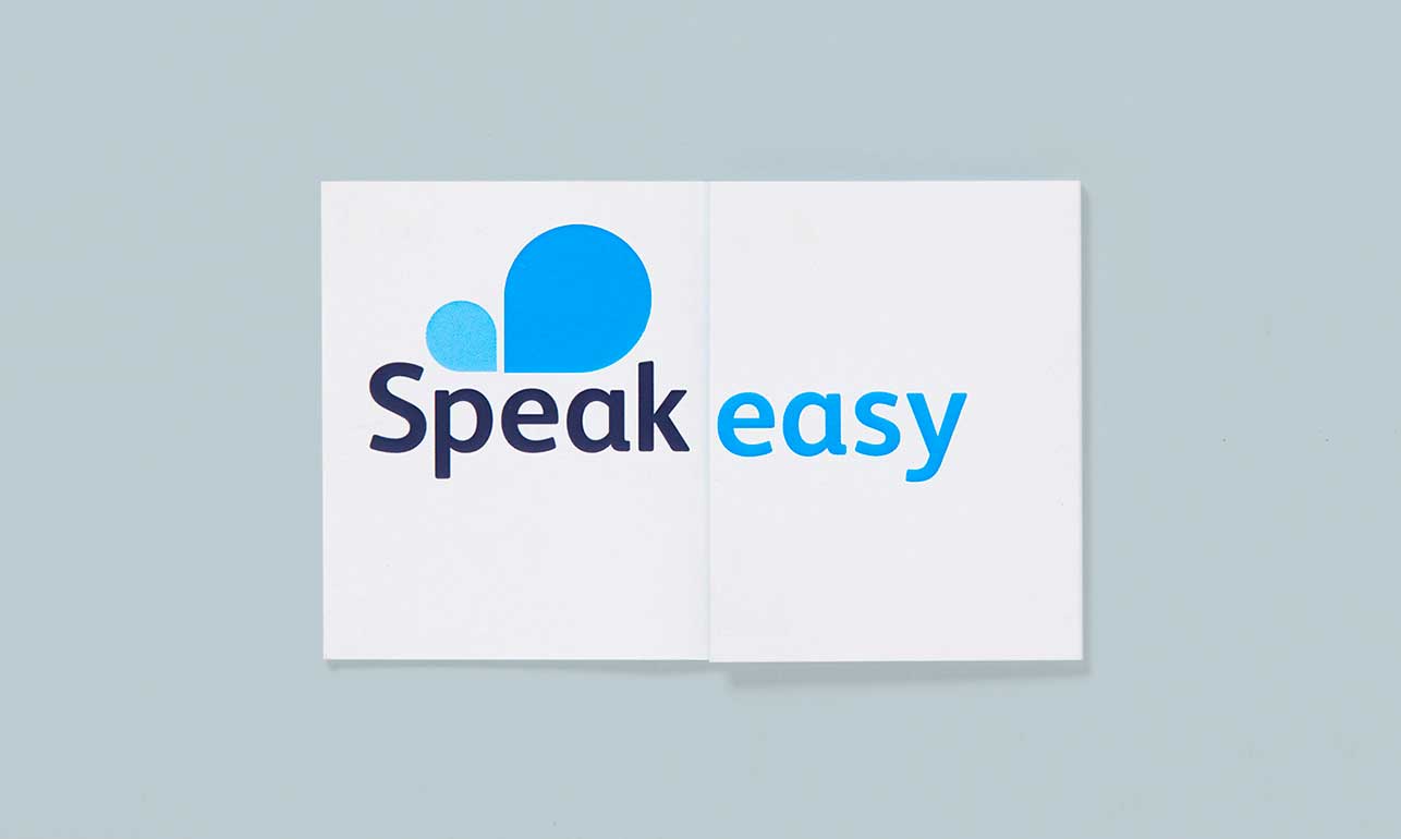
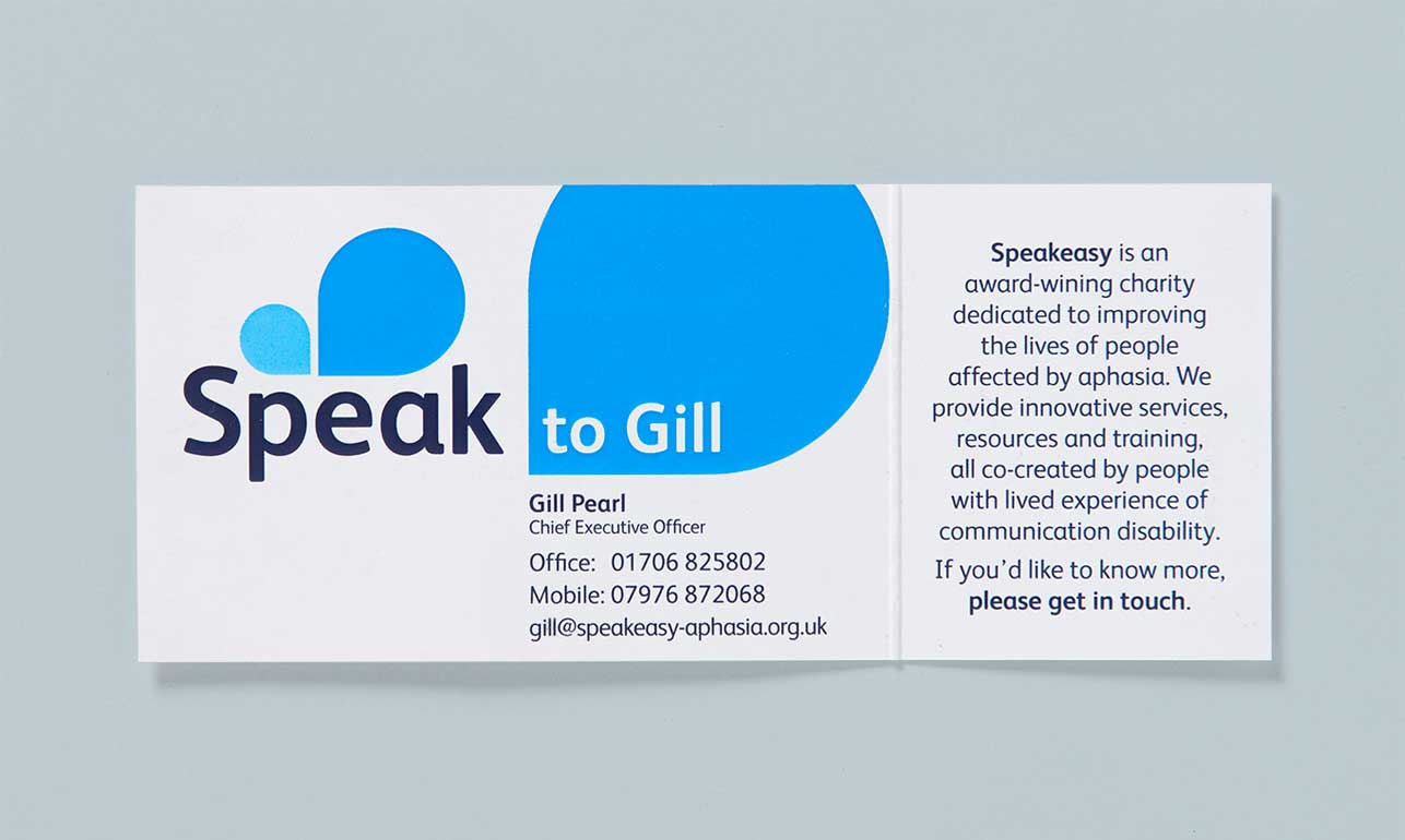
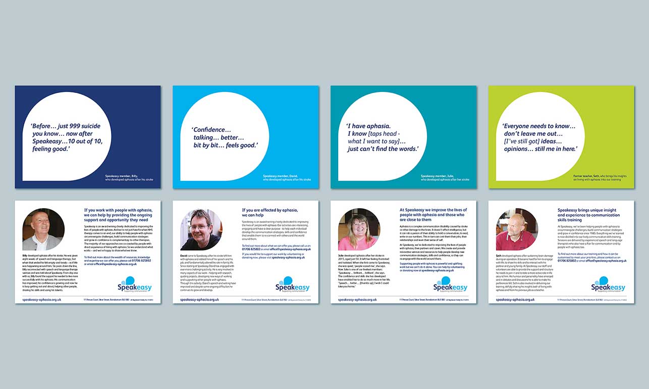
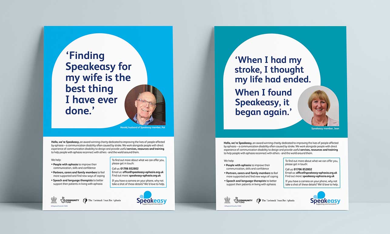
We subsequently evolved the charity’s visual identity via a suite of printed pieces using a palette of vibrant blues and greens, rooted in the original Speakeasy blue. As a result, the charity’s materials at last reflect the professionalism and forward-thinking of their brilliant team.


