YMCA
Marathon recruitment and high value donor materials
Alongside our close collaborator, Lisa Pember, we initially worked with YMCA to develop mailings for a small file of mid to high value donors. Having impressed them with the detailed way we handled the data, allowing for precise targeting which succeeded in reactivating even long-lapsed donors, we were then asked to create a suite of printed materials and digital assets to recruit runners for the London Marathon.
What we did
Project management, design, print and production
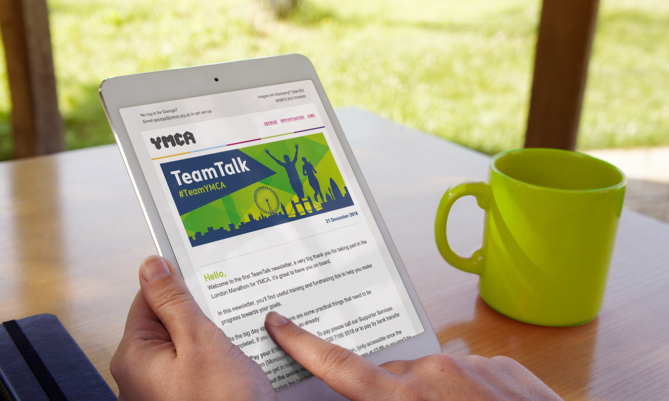
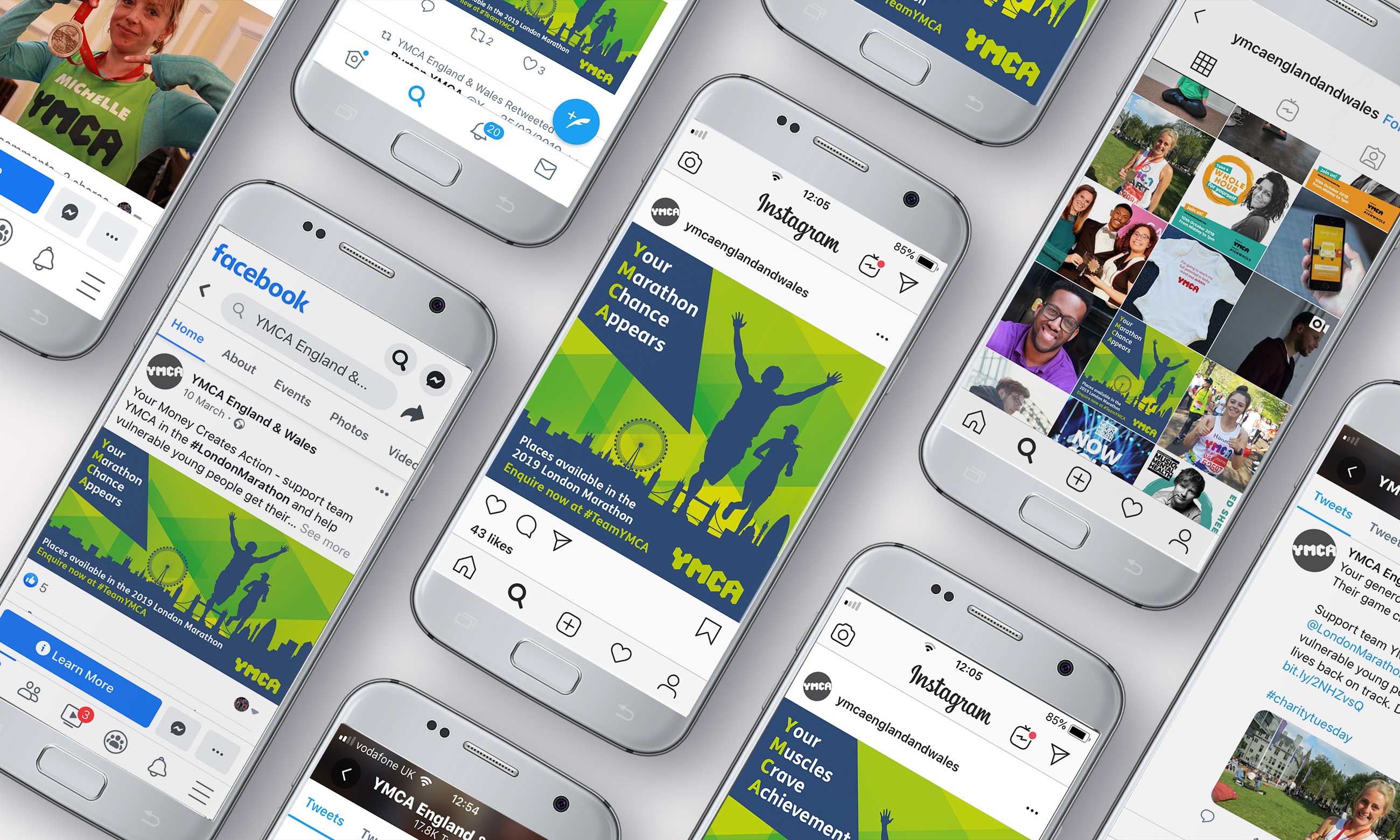
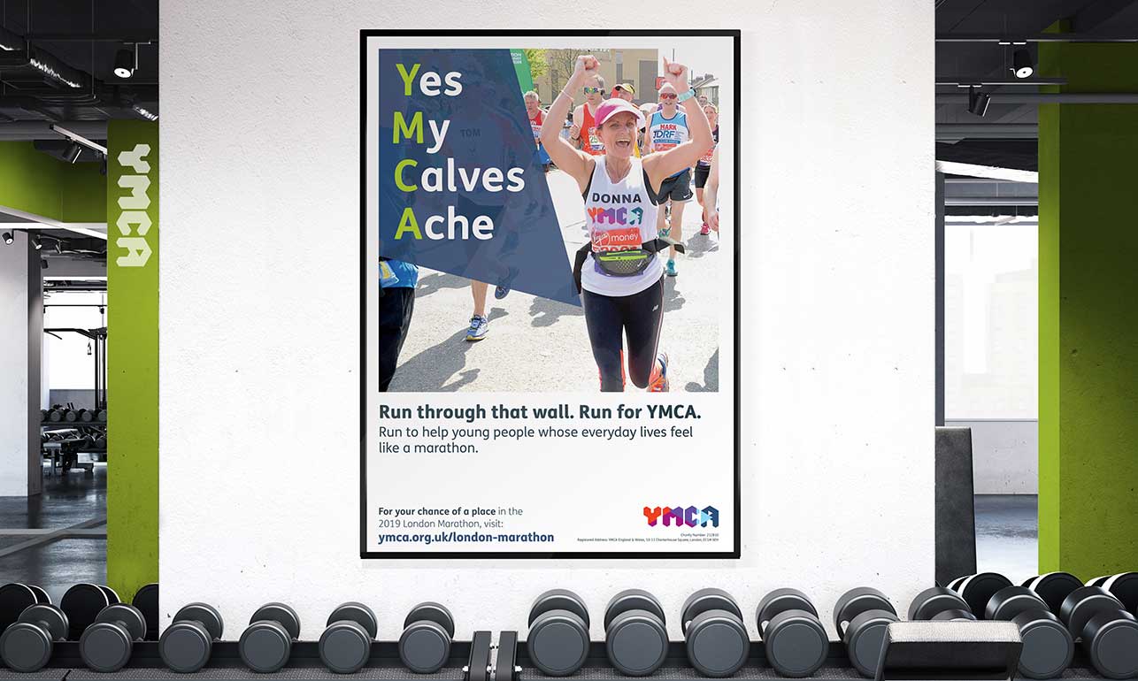
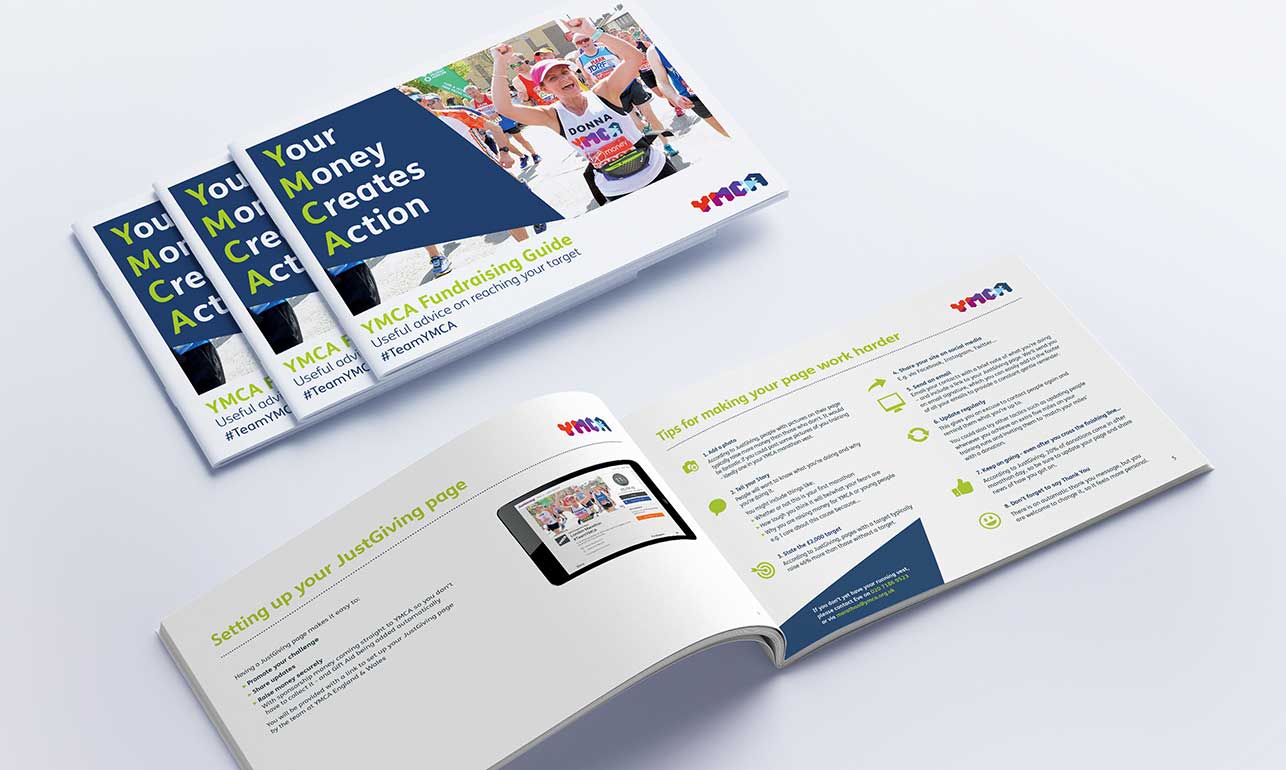
London Marathon recruitment
The client wanted clearly branded recruitment materials that would be easy to update in subsequent years. Punching out the letters ‘YMCA’ in headlines that immediately linked the brand to the experience of running and raising money for the charity pulled everything together.
Encouragingly, this campaign filled all 66 of the YMCA’s marathon places for the first time ever. Previously, the maximum number filled in any year had been 23.
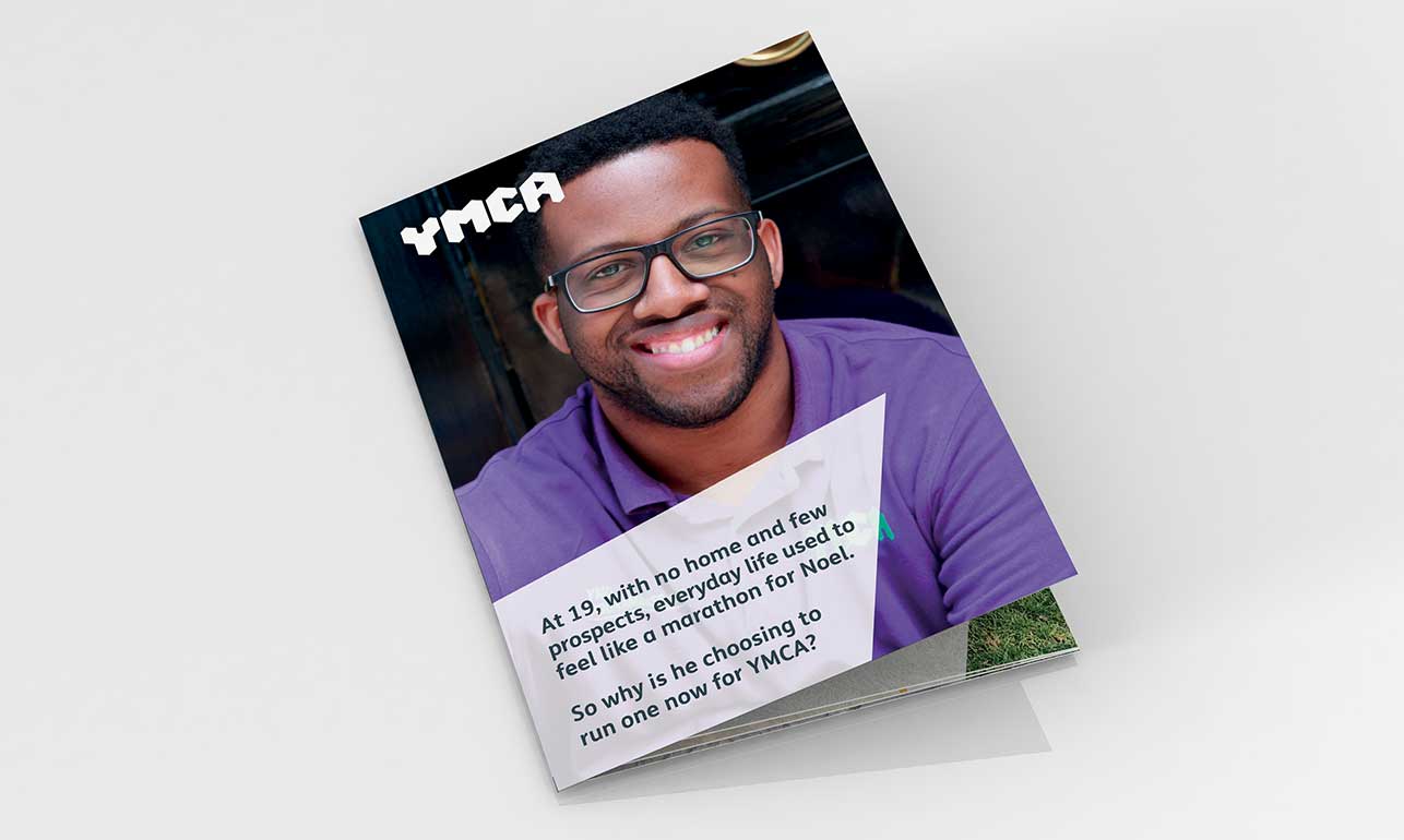
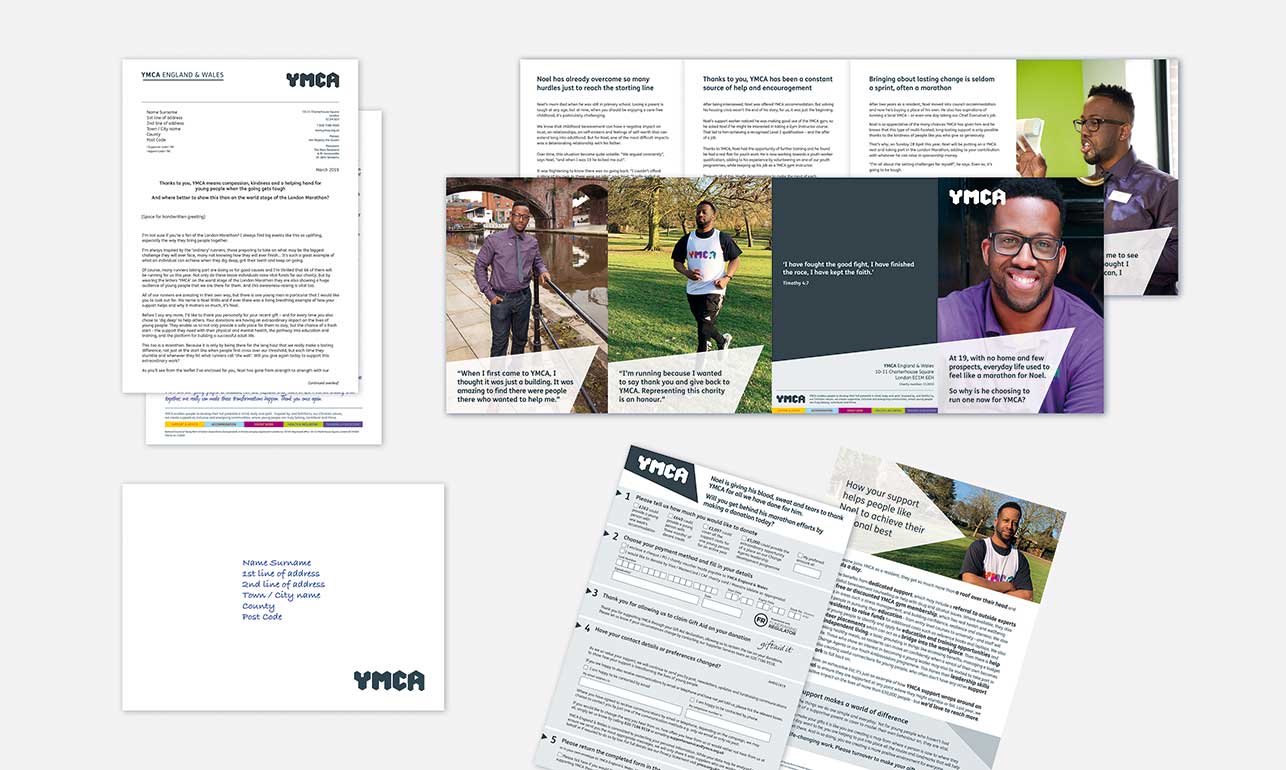
London Marathon Appeal Pack
This pack for the charity’s mid to high value donors was designed to complement the marathon appeal by focussing on Noel; a young man who had already made the journey from service user to member of staff and who was now giving back by running the marathon for YMCA.
While Noel’s story was the ‘hero’ part pf the pack, we spent a lot of time and effort fine-tuning the standard donation form to make it more user-friendly, so that – once engaged – none of our readers would hit the wall before donating. It’s also worth saying that with small audience numbers, we produced this pack to a very tight budget, while still taking pride in every aspect of the job.
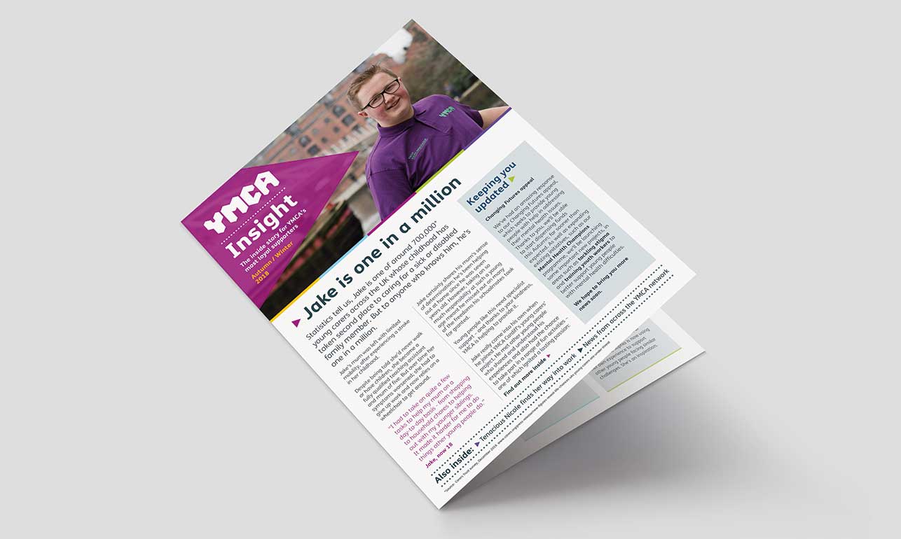
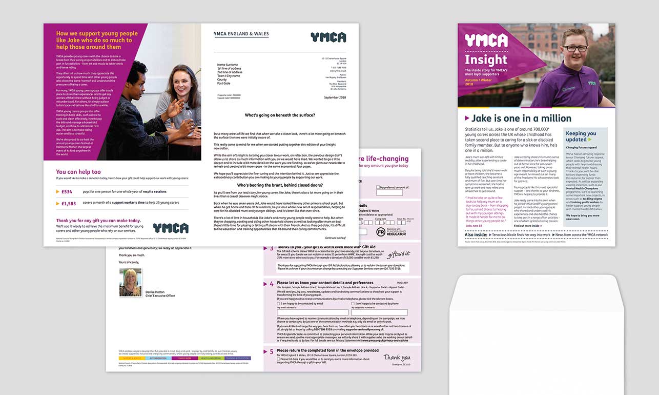
Insight
We were tasked with adapting an update bulletin for mid to high value donors, but could see immediately that the highly-designed-but-tricky-to-navigate style of the original would not wash with our older, well-read donors. Instead of dropping in different images and copy to the busy template, we created something more akin to the reading material ‘our’ supporters would choose for themselves.
Using a masthead to signal ‘news’, we immediately made the content appear more credible, while at the same time using colour and engaging photography to bring the stories to life. Anecdotally, we know readers loved it.